About
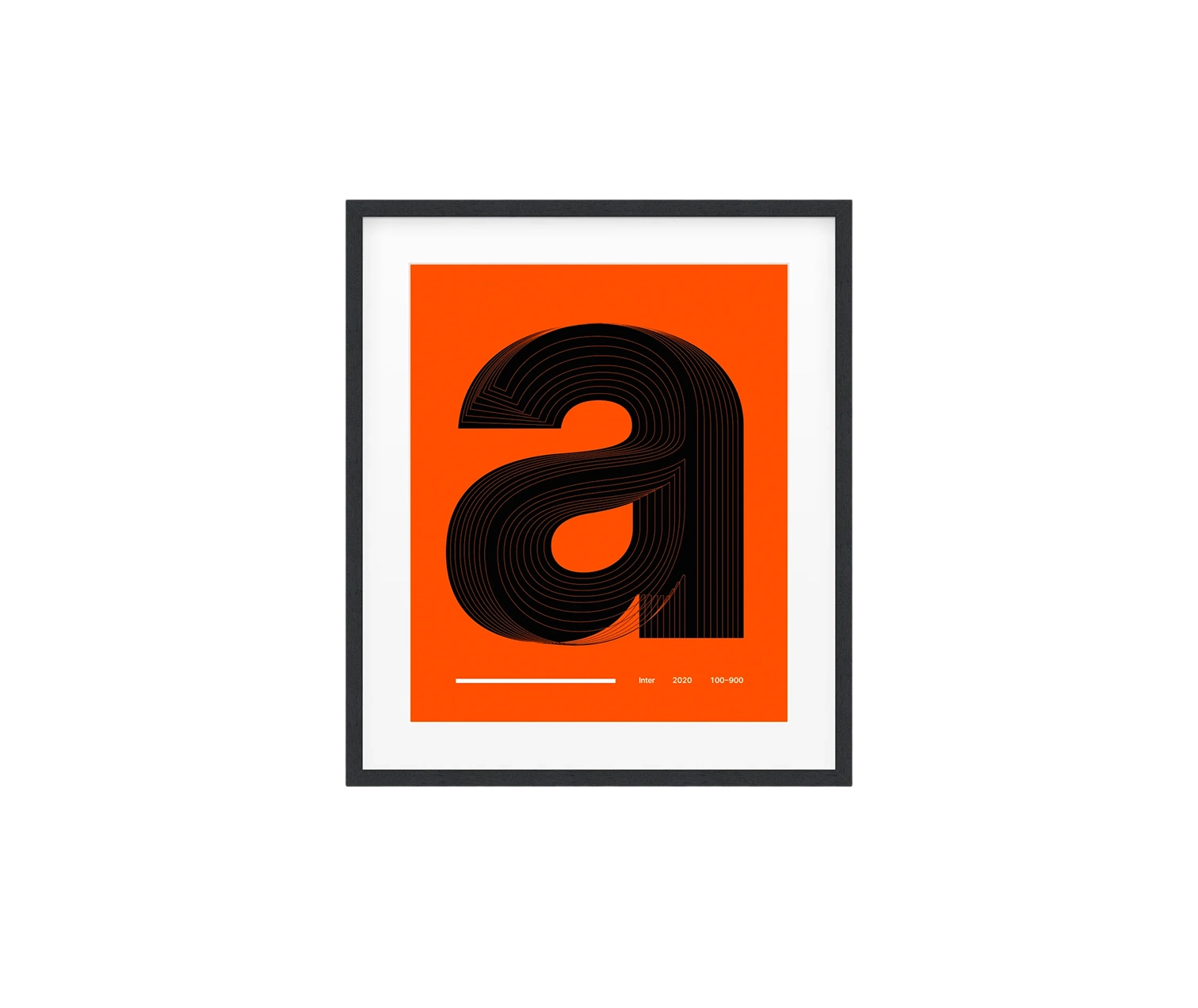
A typographic art print for people who notice the little things. The Inter “a” poster takes a single character and stretches it across weights 100–900, revealing how proportion, contrast, and curve tension evolve in a modern workhorse font. Printed using Giclée on museum‑quality 189 g/m² matte paper, it’s sharp, dense, and non‑glossy, so black stays black and edges stay clean.
Design wise, the superimposed layers create a subtle moiré that reads more as depth than noise, especially at 18×24 where viewing distance suits desks and studios. Go 12×16 for tight wall grids or 24×36 if you want the character to breathe. The alignment is precise, counters remain legible, and the stroke transitions showcase why Inter has become a default for UI and product design.
This isn’t a loud poster. It’s a quiet flex for anyone who obsesses over hinting, kerning, and optical balance. Frame it in black, keep it minimal, and let the letterform do the talking.