About
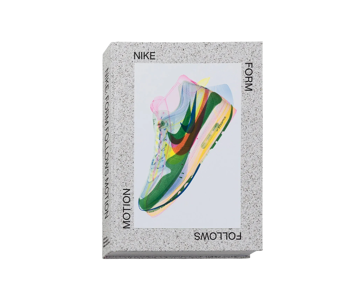
A swoosh drawn in the 1960s is now one of the most reproduced marks on earth, which makes it easy to forget that somebody sat down and drew it. The Vitra Design Museum's 2024 book starts there, at the company's first years, and treats the shape as a piece of work rather than a logo.
Nike: Form Follows Motion is the first book to go through Nike's footwear and apparel archive closely, which is the museum's own claim for it, and it works forward chronologically from those early years through the Air Max to the material and sustainability research the company is running now. Essays take the Air-Sole unit and the Jordan brand apart as design problems instead of products. Interviews with the people involved sit next to images from Nike's creative research and development spaces that had not been published before. The photography was commissioned rather than licensed: Alastair Philip Wiper and the studio Unruh/Jones shot for the book, alongside historical pictures and drawings.
How it is printed carries part of the argument. Four-colour printing has to approximate a fluorescent or a saturated flat out of cyan, magenta, yellow and black, and it never quite arrives. Five spot colours are mixed to their own recipes and laid down as themselves, no approximation involved. On a company whose colours are half of what it is saying, that is the difference between the page and the shoe matching and not. The hardcover keeps the same logic, its board made from seaweed and stamped with foil. The museum shop sells the book in German and in English.
- Published in
- Switzerland

- Publisher
- Vitra Design Museum
- Size
- 352 pages, 474 colour illustrations
- Dimensions
- 30 x 22 centimetres
- Materials
- Ink
- Four-colour print plus five spot colours
Figures as published by the manufacturer. Source