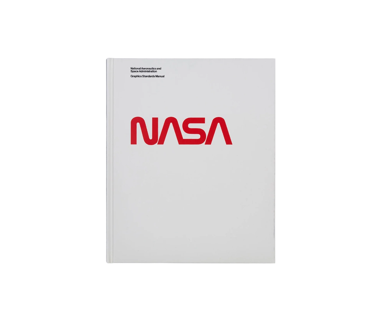
NASA Graphics Standards Manual
$84
About
The logotype everyone calls the worm was retired by NASA in 1992, which means most people who love it have never seen the document that explained how to draw it. Richard Danne's own copy was the one put under the scanner.
Standards Manual's NASA Graphics Standards Manual is a 220-page facsimile of the 1975 identity system Danne and Bruce Blackburn built for the agency, reproduced as it was written rather than redesigned for a modern eye. That means the grids, the logotype construction drawings, the signage, the vehicle and uniform markings, the stationery and the publication templates all arrive in their original order, across 129 image plates. Two pieces come with it that were never sold alongside the manual before: a reproduction of the 35mm slide presentation Danne and Blackburn used to sell the system to NASA in the first place, and the Managers Guide, the follow-up booklet the agency handed to its own staff. Christopher Bonanos writes an essay, Danne a foreword, and Brian Kelley shot the book photography.
The printing is the other half of the argument. Pages run CMYK plus five Pantone spot colours through a stochastic screen, which places ink as randomly scattered micro dots rather than the ruled grid most printing uses, so flat colour stays flat and the plates hold detail the original never had. The binding is case bound, silkscreened in two colours and soft-touch laminated, and each copy ships inside a static shielding pouch, the kind electronics travel in. Standards Manual is clear on one point throughout: NASA neither sponsored nor endorsed the project.
- Published in
- United States

- Author
- Jesse Reed and Hamish Smyth
- Publisher
- Standards Manual
- Size
- 220 pages, 129 image plates
- Dimensions
- 241 x 292 mm
- Materials
- Made in
- Italy

- Ink
- CMYK plus five Pantone spot colours
Figures as published by the manufacturer. Source