Helvetica Forever
$49

About
Most typeface histories are written at a distance, assembled from specimens and second-hand accounts of what a foundry was thinking. This one had a shortcut. The papers of the man who ran the place.
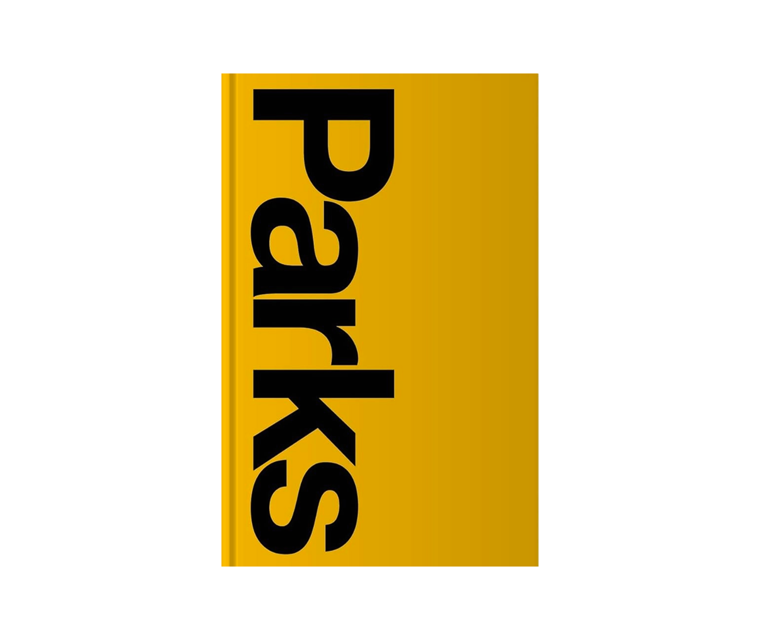
Helvetica forever is Lars Müller Publishers' history of the typeface, built out of the archive of Alfred Hoffmann, who directed the Haas type foundry where Helvetica was made. The face was designed there in 1957 by Max Miedinger, working with Eduard Hoffmann. Rather than lean on the retellings that piled up afterwards, the book takes its documentation from the foundry's own record, and that source decides its shape: first Helvetica set beside the well-known sans serifs of the twentieth century, then the harder question of why this one spread as far as it did.
The answer the editors keep returning to is the quality people still argue about. The letterforms are balanced and read as neutral. They forgo a high degree of expressivity, and that restraint has drawn as much criticism as admiration. Fifty years of use follow in 150 illustrations, running from signal design to party flyers, which is a good deal wider than any type specimen would ever show you.
Lars Müller and Victor Malsy edited it, with contributions from Axel Langer and Indra Kupferschmid. The two editors set the book themselves, with Integral Lars Müller. The English edition arrived in 2011, three years after the German one, which is a long wait for a book about a face nobody can avoid looking at.
- Published in
- Switzerland

- Editor
- Lars Müller and Victor Malsy
- Publisher
- Lars Müller Publishers
- Size
- 160 pages, 150 illustrations
- Body
- Hardback
- Dimensions
- 19 x 26 cm
Figures as published by the manufacturer. Source